As we celebrate this timely exhibition of Norman Carton’s phenomenal burst of works on paper in the Fifties and Sixties, let’s consider the rhythms of history, particularly the way a sudden boom is followed by a long echo. This is the pattern by which innovation is assimilated into a style. The works on paper by Carton that the Quogue Gallery, which has distinguished itself in this space of rediscovering great Abstract Expressionist art, are part of a significant example of this pattern. Back at the origins of Western art, the animated grace of Phidias was so irresistible an influence that it shaped centuries of sculpture, down through Roman antiquity to Michelangelo and Rodin. Without Rubens and the earthquake of the Baroque, the great chromatic wave of Delacroix that eventually crested with the Impressionists would never have happened. The Impressionists themselves were the thunder clap that resounded in two stupendous moments in European history, the well known Cubist breakthrough of Braque and Picasso in Paris and the lesser known (but more germane to our consideration of Carton) Blaue Reiter, led by Kandinsky, Marc and Klee in Munich. The same game may be played with other arts. The towering chord progressions of Bach resounded until the thunderstorm of Beethoven and then it was jazz that changed music with modal change that upset the very scales themselves. Do you like hockey? One day in practice at the Montreal Forum, Bernie “Boom Boom” Geoffrion invented the slapshot (his nickname was a teammate’s joke, the first boom when the blade banged the puck and the second when it hit the boards, having missed the net). When Bobby Hull finally found out how to aim that cannon, the whole sport was altered.
Hands down the boom to blow away booms in our country was Abstract Expressionism. To this day it remains the apex of the dramatic outbursts of originality to which so many artists in their studios respond. That thunderclap is our starting point in an understanding of Norman Carton and his place in art history. The enfants terribles of the Cedar Tavern, wrestling on the floor or trading insults at meetings, took the “action” in “action painting” to heart. They were fighting for recognition with the Surrealists who had arrived uptown in Manhattan, from Europe. Even Mondrian and Matta were in town, as were the heroic and politically tempestuous Mexicans, Rivera, Kahlo and Orozco. Carton was there, but with a difference.
By 1960, when many of the most dynamic and rewarding of the works in the exhibition were painted, what had become of Abstract Expressionism? One answer is offered by the conceptual and at the same time painterly experiments of Rauschenberg and Johns (Rauschenberg’s Bed was made in 1955 and is considered the pivotal piece in the post-Abstract Expressionist moment). I confess that while I savor the encaustic paintings of Johns and the loose, usually red brushstrokes of Rauschenberg of the 50s, I have always viewed those two co-conspirators as the beginning of a markedly different approach to the studio. Rauschenberg’s famous quote about art and life: “Painting relates to both art and life. Neither can be made (I try to act in the gap between the two).” That parenthetical bit was the egress by which Abstract Expressionism moved out of the art realm and more into life as a contrast. Some painters preferred to stay within art.
Norman Carton, with his academic training, his love of studio process and materials (he ground his own vivid pigments) and his mastery of art history, stuck to art as part of life. As these wonderfully painterly, quite often large and substantive works in gouache triumphantly show, there was plenty of room left to operate in the Abstract Expressionist style, especially when it came to color. In this way, Carton’s efflorescence of bright-hued, high-value reds, blues, golds and greens are reminiscent of the second wave of Cubism, which had started with such a subdued palette (grey, black, white, that brown they derived mimetically from wood and the caning of the chairs) but then, even in the hands of Picasso, Gris, Delaunay and Leger, who was liberated from the grey of the trenches, it gained a lively, colorful second wind. The first phase was Analytic Cubism, and the color phase was Synthetic. The artist’s son Jake reminded me that Carton adored Picasso and the two were photographed together on opening night at the Paris Opera when Carton was the set designer for productions that also involved Serge Lifar, Paul Valery and Earl Kerkham, an AbEx pioneer. What was the epochal early show of Abstract Expressionism? The starkly tragic, black on white format of Pollock, Kline, Motherwell and the others included in a 1950 show of that title at the Samuel Kootz gallery. As with Synthetic Cubism, color arrived at the AbEx party late, with Hans Hoffmann, Sam Francis, Helen Frankenthaler and Norman Carton among others.
If Jackson Pollock’s life is taken as the archetypal narrative of the Abstract Expressionist painter’s story—the epitome of a quintessentially American innocence finding his wings by some kind of natural instinct—then the life of Norman Carton is certainly atypical. As a mere child he led his family from the Ukraine, where they faced the peril of the pogroms, to Philadelphia, where he attended the Pennsylvania Museum School of Industrial Art in the 1920s (his extracurricular gig, putting him in the company of the big names of the Ashcan School, was as illustrator for the Philadelphia Record). Then he studied under Henry McCarter (pupil of Toulouse-Lautrec, Puvis de Chavannes and Thomas Eakins) as well as Arthur Carles. He made it to Paris in 1934 (all good Americans go to Paris, as Gertrude Stein said) at the moment when not only Picasso and Matisse were the giants, but Kandinsky, Miro and Klee as well (all their influences can be discerned in the works on view if you are inclined that way, and Carton’s family confirms that Kandinsky in particular was on Carton’s mind since his European fellowship trip in the 1930s). I find it fascinating that on his return to Philly he completed his studies at the Barnes Foundation, introducing the intellectual framework of John Dewey (he later started an artist-run gallery called Dewey). With the WPA he worked on murals (the large scale of some of these works, that mastery of long horizontals especially, would have been part of his daily work). During the War he was a designer and draftsman at the Cramps Shipbuilding Corporation, and started welding metal sculpture. Then (the life is as meandering as one of his long calligraphic brushstrokes) he started a fabric design firm that turned out original patterns for Lord & Taylor, Nina Ricci, and Gimbels. Only in 1949, when he decided (like Hans Hoffmann, a close comparison) to devote himself to painting, did he have his first solo exhibition at the Philadelphia Alliance. His second major trip to Paris was in June 1950 and it lit a fire under his art. He was witness to the restoration of the Mona Lisa (he had permission to remove it from its frame) and showed at the Sorbonne, Galerie d’Art, and Gallery Rene Breteau and in the salons of that year, including Les Surindependants, Salon d’Automne, and Realities Nouvelles.
He moved to New York in 1953, and by 1955 he was in the Whitney Museum’s major group show of Contemporary American painting, alongside Richard Diebenkorn, Joan Mitchell, James Brooks, Grace Hartigan, Franz Kline, Georgia O’Keefe, Adolph Gottlieb, and others. One of the major, knockout paintings he made after returning from Paris, Manhattan Gothic, is a highlight of my current exhibition at the Nassau Museum. During his lifetime, Carton was in more than 135 group exhibitions and more than 20 one-man shows and taught at the New School and Long Island University.
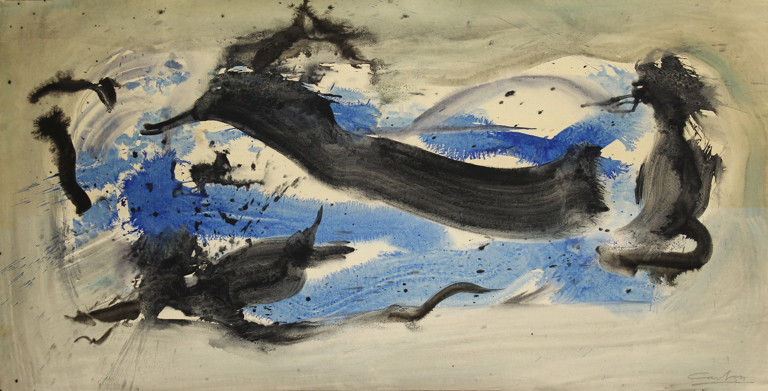
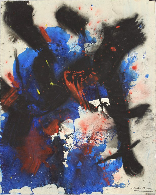
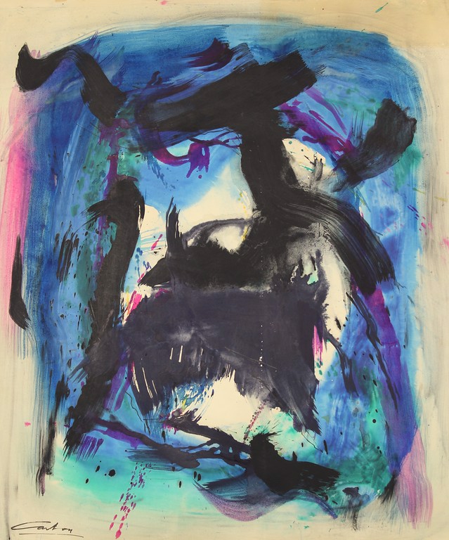
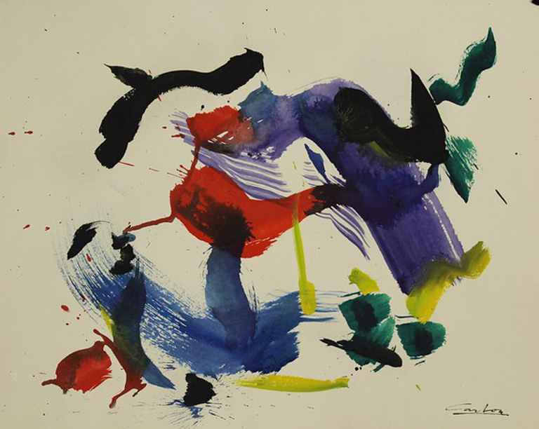
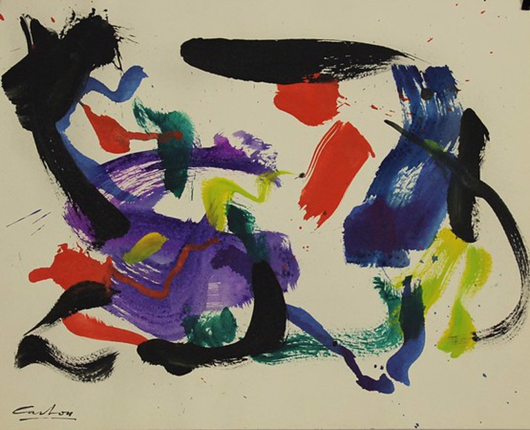
As we approach the paintings of the Fifties and Sixties, some aspects of this biography are more relevant than others. Carton’s relationship to the art he saw in Paris is a major factor. There is a whole story about the many ways in which Joan Miro influenced the Abstract Expressionists, especially the well-known impact of his Constellations series upon Pollock when he saw them in Manhattan in January 1945 (they had been smuggled out of Europe by Pierre Matisse). You don’t need a long art history lesson to see the kinship between Miro’s heavier black mark-making which he married with bright clouds of color and the fantastically calligraphic Carton works such as Three Black Stripes or Knot line, which even has that favorite Miro grouping of the primaries (the blue he used in the Twenties for Photo: Ceci est la couleur de mes reves one of his most poetic masterpieces), the hot red and a lemon yellow with its attendant green, vegetal and fresh. Carton hung several Miro works in his son’s childhood room in their Manhattan apartment. I particularly admire the way the downward stroke of black on the right hand side runs out of paint and stutters to its close, like the notoriously difficult fei bai (“flying white”) stroke of Chinese calligraphy. That same calligraphic quality, with the fluidity of the black gouache adopting the transparency of ink, is the hallmark of Blue Florence. The cerulean gouache seeps like watercolor into the paper, spreading in tentacles of runaway color, while the marvelous ribbon of black pursues its course, fold upon fold (pli selon pli, as in the Mallarme poem) like a long, slow de Kooning stroke unwinding with tremendous control. The sumi flung droplets and quick finish of Gesture, which reminds me of Sam Francis and his use of an interior white space, focuses this vocabulary on a more basic set of marks. Speaking of Francis, who posed his own singular response to the new directions of Abstract Expressionism, the range of blues surrounding the black gateway of Bel Manor has certain stylistic resemblances to the way Francis would push the blue to the edges of the canvas or sheet, but with Carton there is actually so much more going on at the center as stroke crosses stroke. The similar play of black gesture and color field is found in Black Reel, which turns up the temperature from the cool, aqueous blues to the sunny reds and oranges that dip and hover around the delta wing shape at the center.
Norman Carton, “Three Black Stripes (No. 2232),” 1960, Gouache on paper, 23″ x 19″
Norman Carton, “Knot Line (No. 2349),” 1960, Gouache on paper, 19″ x 12″
Norman Carton, “Blue Florence (No. 2256),” 1960, Gouache on paper, 26.5″ x 51″
Norman Carton, “Bel-Manor (No. 2300),” 1960, Gouache on paper, 44″ x 36.5″
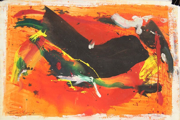
Norman Carton, “Black Reel (No. 2334),” 1960, Gouache on paper, 15.5″ x 22″
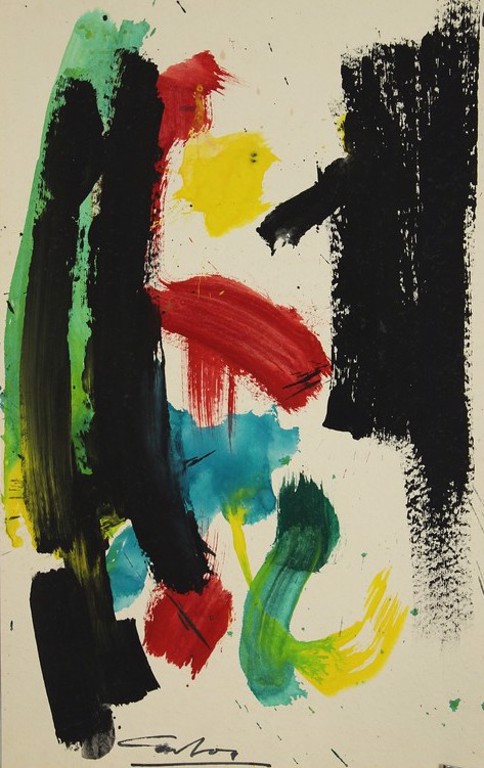
The emotional or psychological transition from the black-dominated compositions to Larkline and Larkbon is like night and day. The sensation of flight is incontestable in these gravity-free paintings, floating their blue and red in motion across the white field.
Norman Carton, “Larkline (No. 2293),” 1960, Gouache on paper, 19″ x 24″
Norman Carton, “Larkbon (No. 2292),” 1960, Gouache on paper, 19″ x 24″
When I consider the extreme difficulties of Carton’s early life, the hair-raising tale of escape to the United States, burdened at a tender age with shepherding his whole family to safety including the almost incredible task of translating through seven languages, it puts these buoyant, colorful paintings in a whole new context. Such an efflorescence of color, light and freedom actually reminds me of one of my favorite moments in Shakespeare’s sonnets. The first eight lines of the poem, which I will spare you in order not to dampen your mood, are filled with depression, regret and anxiety. Then, at the “turn” from the octet to the sestet if you divide the fourteen lines structurally, Shakespeare changes from the minor key to the major, from descent into ascent, in one of the great redemptions in all poetry. It is the perfect epigraph for this ebullient, sun-filled show:
Haply I think on thee, and then my state,
Like to the lark at break of day arising
From sullen earth, sings hymns at heaven’s gate.
Charles A. Riley II, PhD
Cutchogue, New York
June 2020
Charles A. Riley II, PhD is the director of the Nassau County Museum of Art and the author of 37 books on the arts and cultural history. He resides in Cutchogue, New York and Manhattan.